Chapter 2 Code, Spreadsheets, and Graphs
2.1 Incorporating Code
As the baseline, we have already remarked that R statistical code appears in the text, although it does not overwhelm readers via the Show/Hide features that we are using.
- It will be straight forward to also include Python code in the same fashion.
- We also have a supporting site for statistical code that allows viewers to get more experience analyzing loss data using
R.
Going forward, we want the ability to include more interactive code. The idea here is that include code in a box, allow users to modify the code, and then execute it.
2.1.1 Datacamp
The best method that we currently have available is the Datacamp platform. On our Github site, you can find code that demonstrates our extensive experience with the Datacamp Lite package.
R Code For Varying Payments with Uncertainty
2.1.2 Rdrr.io Alternative
The main limitation of the Datacamp method is that the graphs do not look so great. An alternative is Rdrr.io; here, the graphs look better. However, at this point, we do not how to use the code to read external data, a major limitation.
The procedure for including this code into a markdown page is drawn from the Rdrr.io embedding site.
- Copy the code into the box under “Adding your own R code”
- Hit the button to “Generate embed code”
- Copy the embed code into the markdown document.
R Code For Varying Payments with Uncertainty - Plot Looks Better than via Datacamp
R Code That Does not Work - Tries to Read External Data
2.2 A Few Words on Spreadsheets
We have experimented with a few spreadsheet approaches. So far, the OneDrive approach is far simpler to implement. It may be that dynamic spreadsheets can be eventually used; in principle they require only javascript and so should be more accessible to users in distant reaches of the globe. However, at the moment, they are difficult to code and to maintain.
2.2.1 OneDrive
The approach is outlined at the site Share it: Embed an Excel workbook on your web page or blog from OneDrive. Essentially, one uploads the spreadsheet to OneDrive (a Microsoft thing) and then places code to embed it into html page.
Display. Ten Year Cash Flow Spreadsheet
2.2.2 Dynamic Spreadsheets
These are the results of experimentation with the Jspreadsheet javascript package for dynamic spreadsheets (formerly called jExcel). It utilizes the “Highcharts” package for dynamic graphs.
This was working before but the developer made some enhancements. So, now this needs to be fixed (maybe later….).
Table 3.1. Varying Payments and Rates of Interest
2.3 More on Graphs
As mentioned before, we have incorporated a number of animated graphs in the Simulation Chapter 6. These are coded in R - although moving (animated), they do not require user interaction.
2.3.1 Three Dimensional Interactive Graphs
2.3.1.1 Basic R Graphs
The basic R graphs look fine.
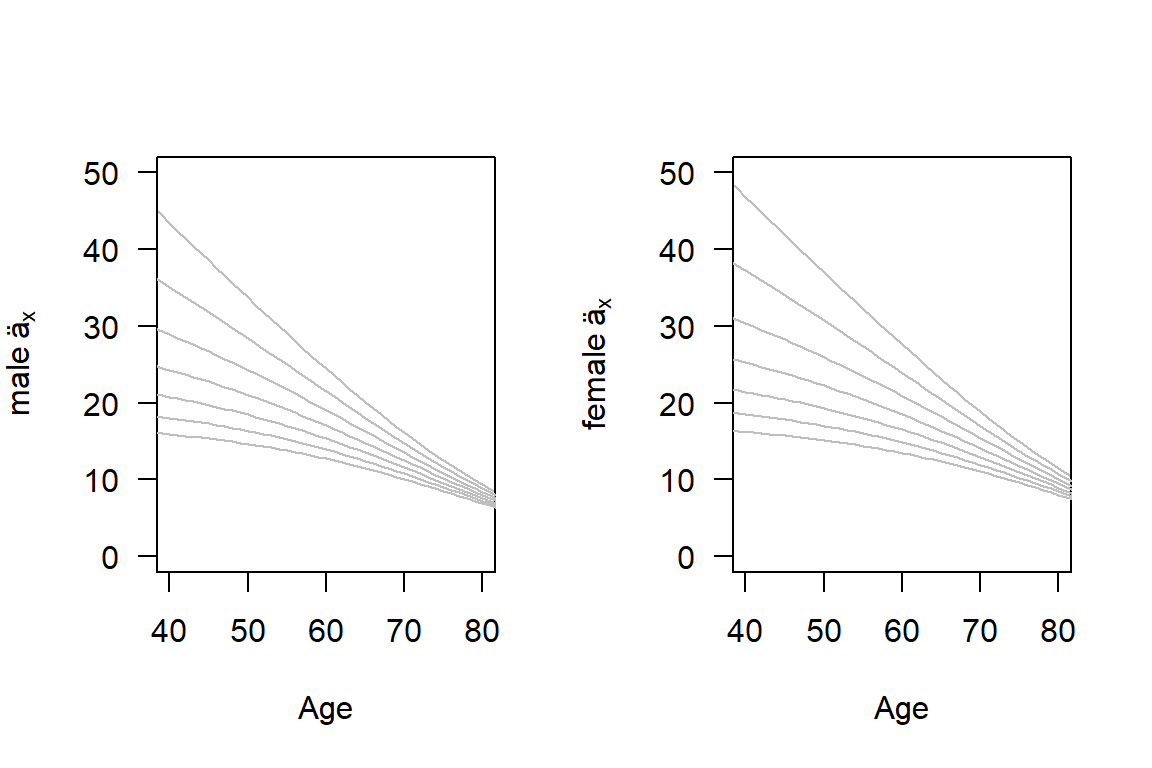
Figure 2.1: Life Annuities by Age, Interest Rate, and Gender. Male annuities are in the left-hand panel, those for females are in the right. For both panels, each line corresponds to an interest rates with the top line being \(i=0\) and the bottom line being \(i=0.06\).
2.3.2 GGPLOT
Although those rendered via ggplot2 are nicer.
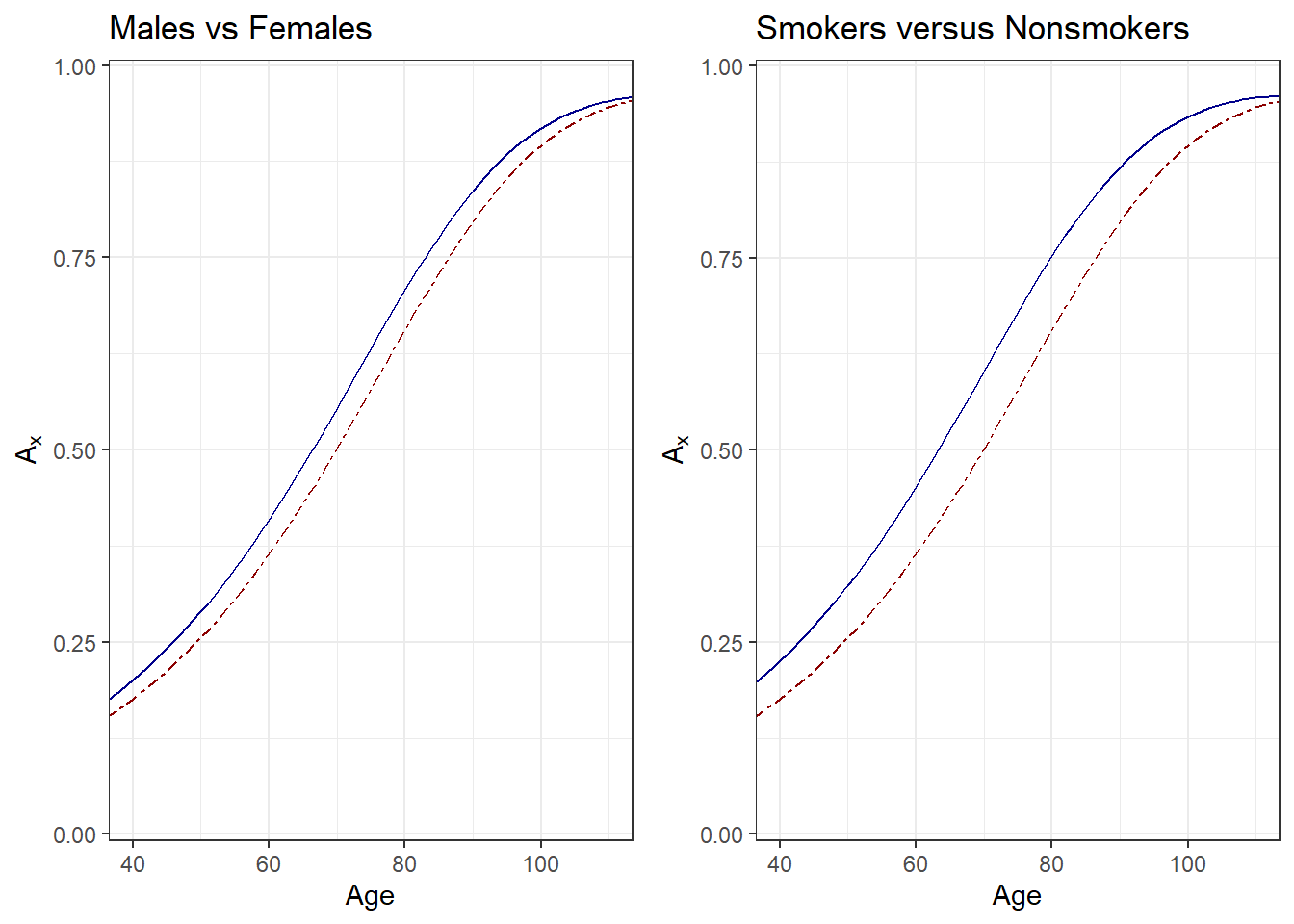
Figure 2.2: Life Insurance by Age, Gender, and Smoking Status. Both panels show expected presented values \(A_x\) by age \(x\). For the left-hand panel, males are shown as solid blue, females as dark red dashed. For the right-hand panel, smokers are shown as solid blue, nonsmokers as dark red dashed.
2.3.2.1 Interactive Three dimensional Graphs
We can also embed interactive graphs using webgl.
Figure 3.10a. Interactive Version of Figure 3.10. Use the mouse to rotate the figure to see different perspectives. One can use this plot to motivate a type of multiplicative effect that an interest rate and age has on an annuity value.